Cybersecurity dashboard · B2B data product · Data visualization
Making cybersecurity risk understandable to technical and non-technical users
Redesigning a Power BI and Excel-based analytics experience into a clearer risk dashboard
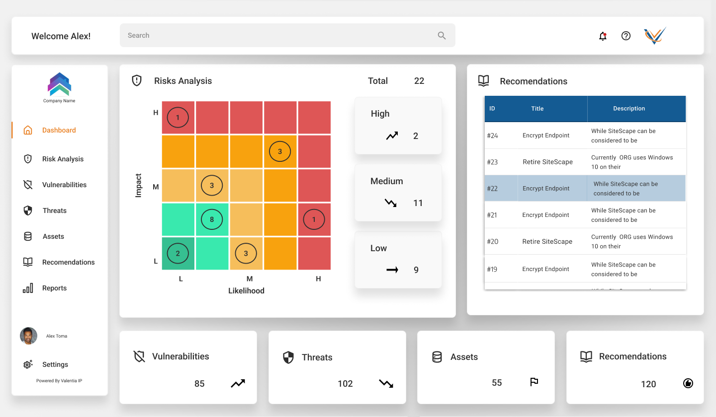
Valencia IIP is a cybersecurity startup offering services that reveal vulnerabilities and help organizations minimize security risk. Their existing engine ran on Power BI and Excel functions. I redesigned it into an intelligent dashboard that displays risks and KPIs clearly to both technical and non-technical clients — a textbook Double Diamond, from a three-part discovery through to a tested, delivered product.
Approached with the Double Diamond
Overview
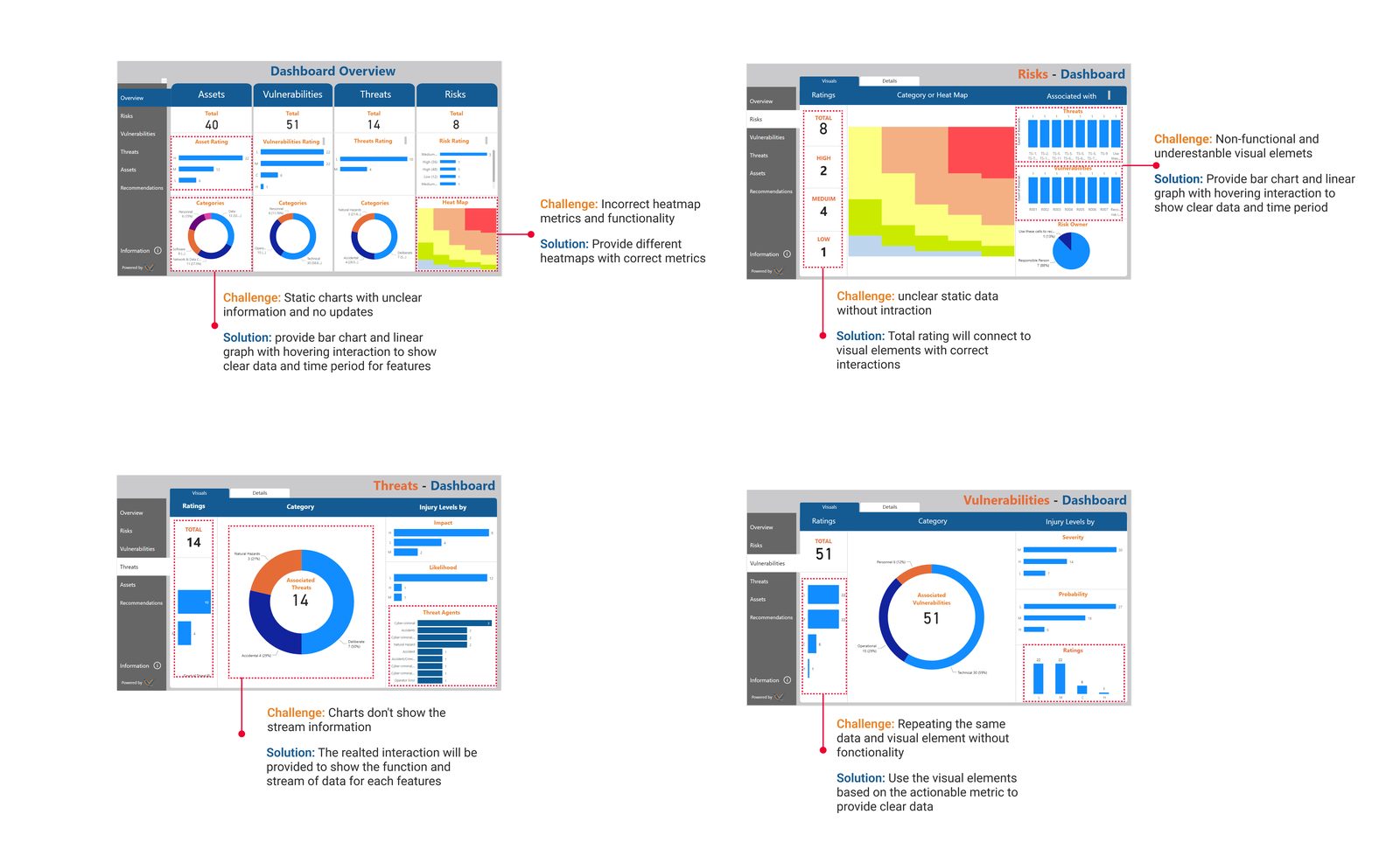
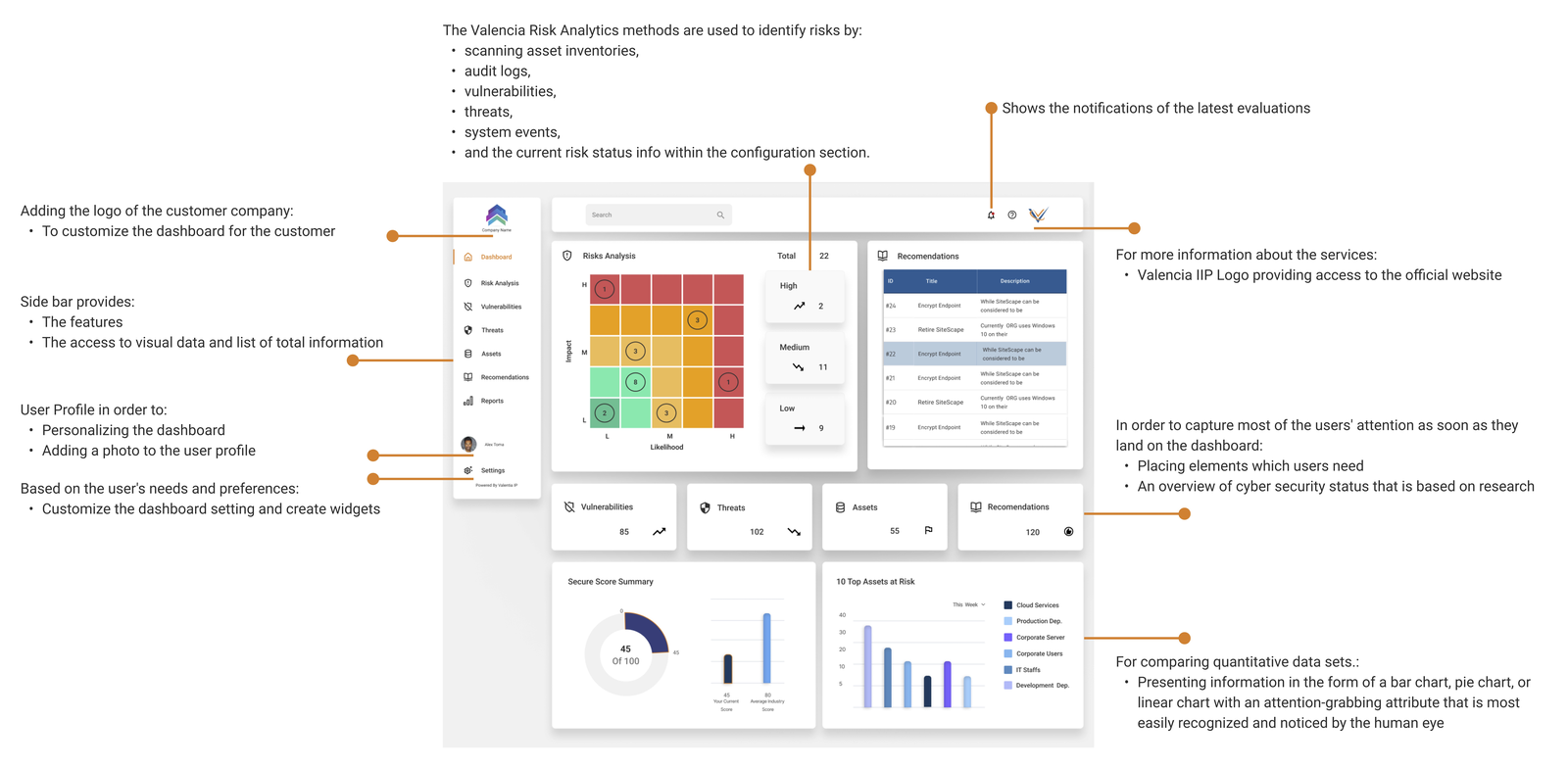
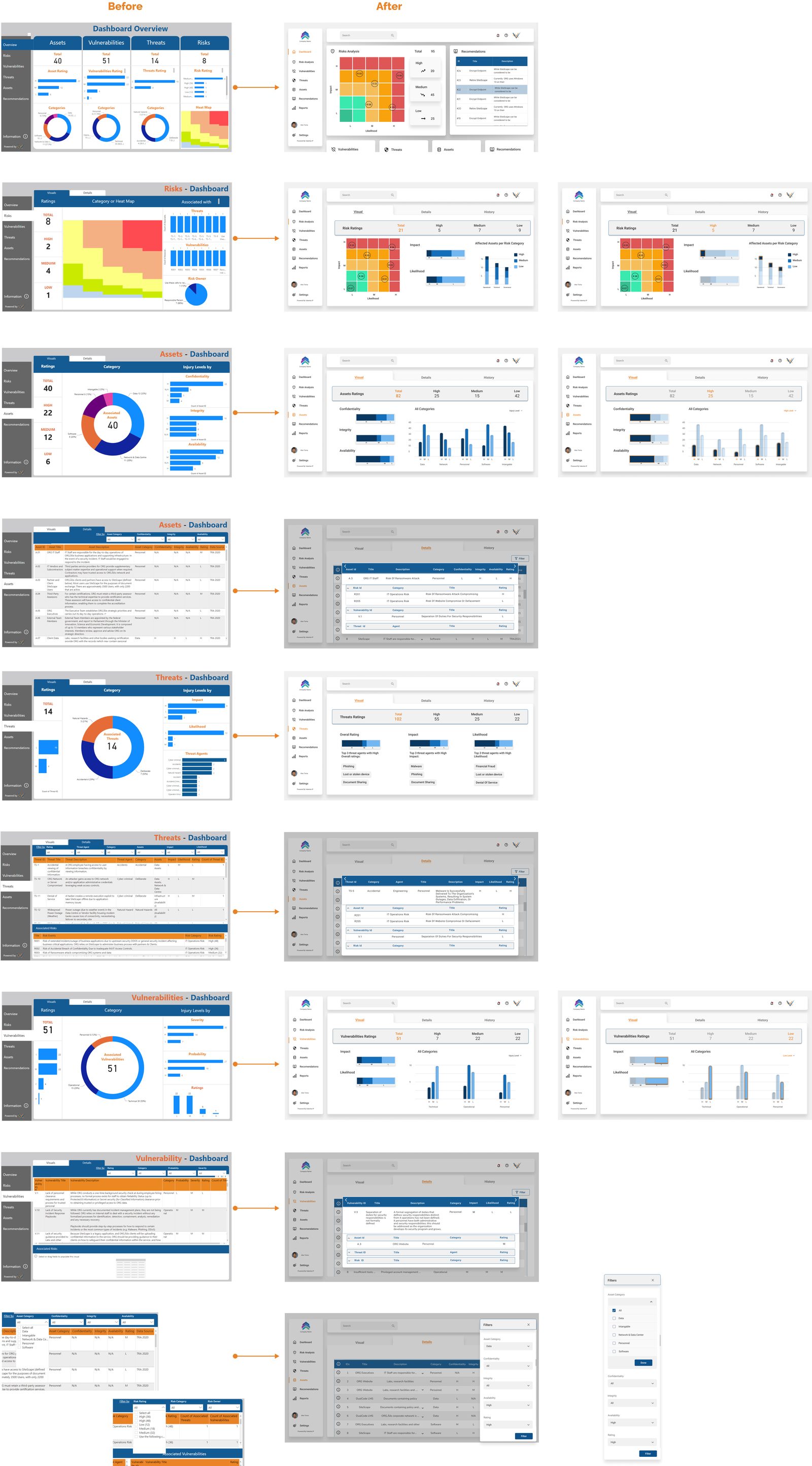
The dashboard needed to support threat and risk assessments against Canadian and international standards, application security reviews, and vulnerability assessment and penetration testing — each with heatmaps and charts — plus guidance on cyber-insurance requirements and business-continuity planning. The previous version lacked live visualization, was hard to navigate, and displayed the wrong metrics.
Three-part research
Heuristic evaluation, competitive analysis, interviews
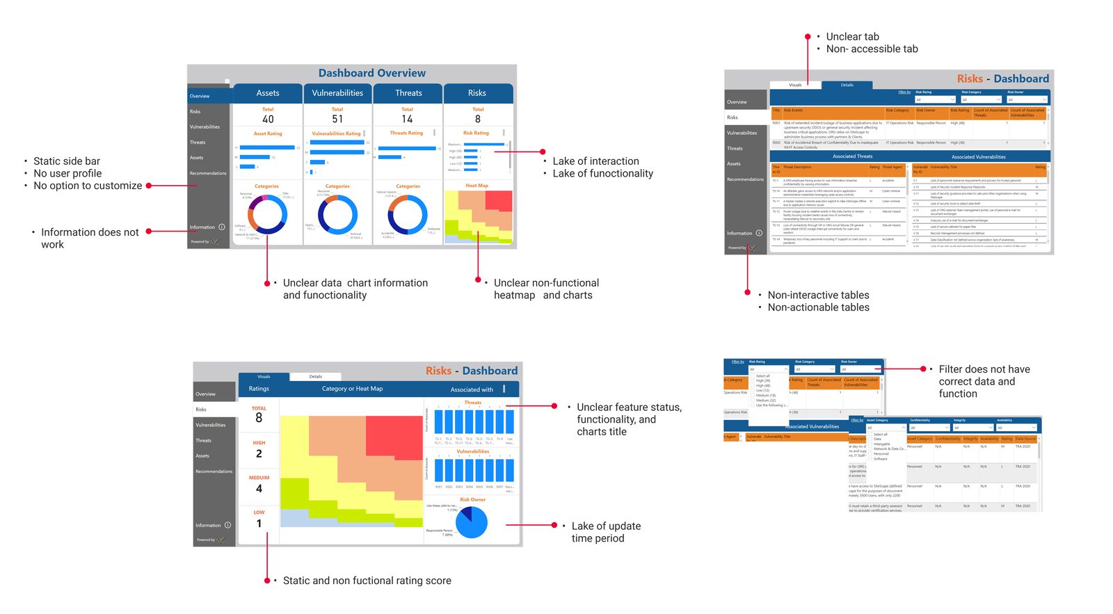
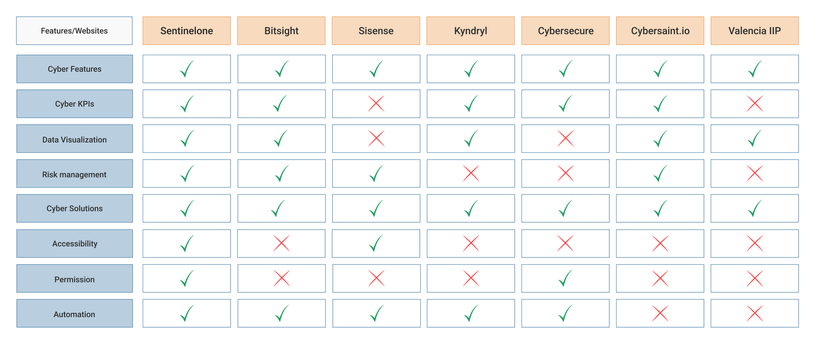
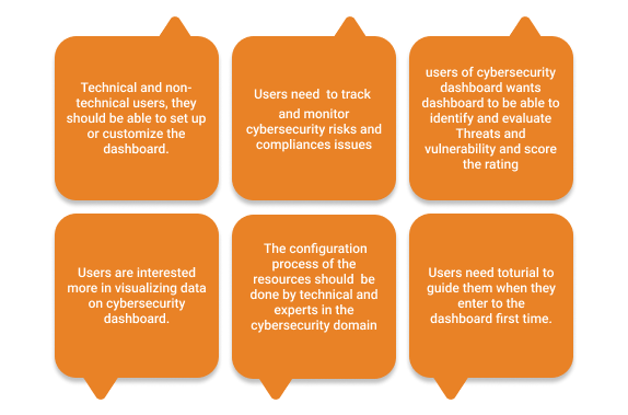
Discovery ran in three phases to understand both the market and the users. A heuristic evaluation of the existing Power BI dashboard identified the real problems and requirements; a competitive analysis studied cybersecurity dashboards and KPIs across the market; and interviews with technical researchers and two real customers built domain knowledge and surfaced user expectations, mindsets, and behaviours.

Challenges & user flow
Restructuring around users, not the database
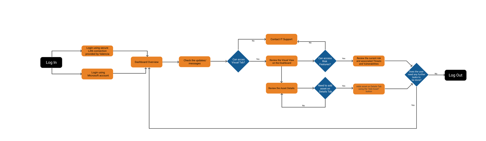
Synthesizing the research confirmed the core challenges and pointed to the key move: redesign the user flows completely to reflect user needs rather than the database perspective. In the new experience, policies are edited in context and users get immediate feedback and live data — they change what they see, and see what they change.
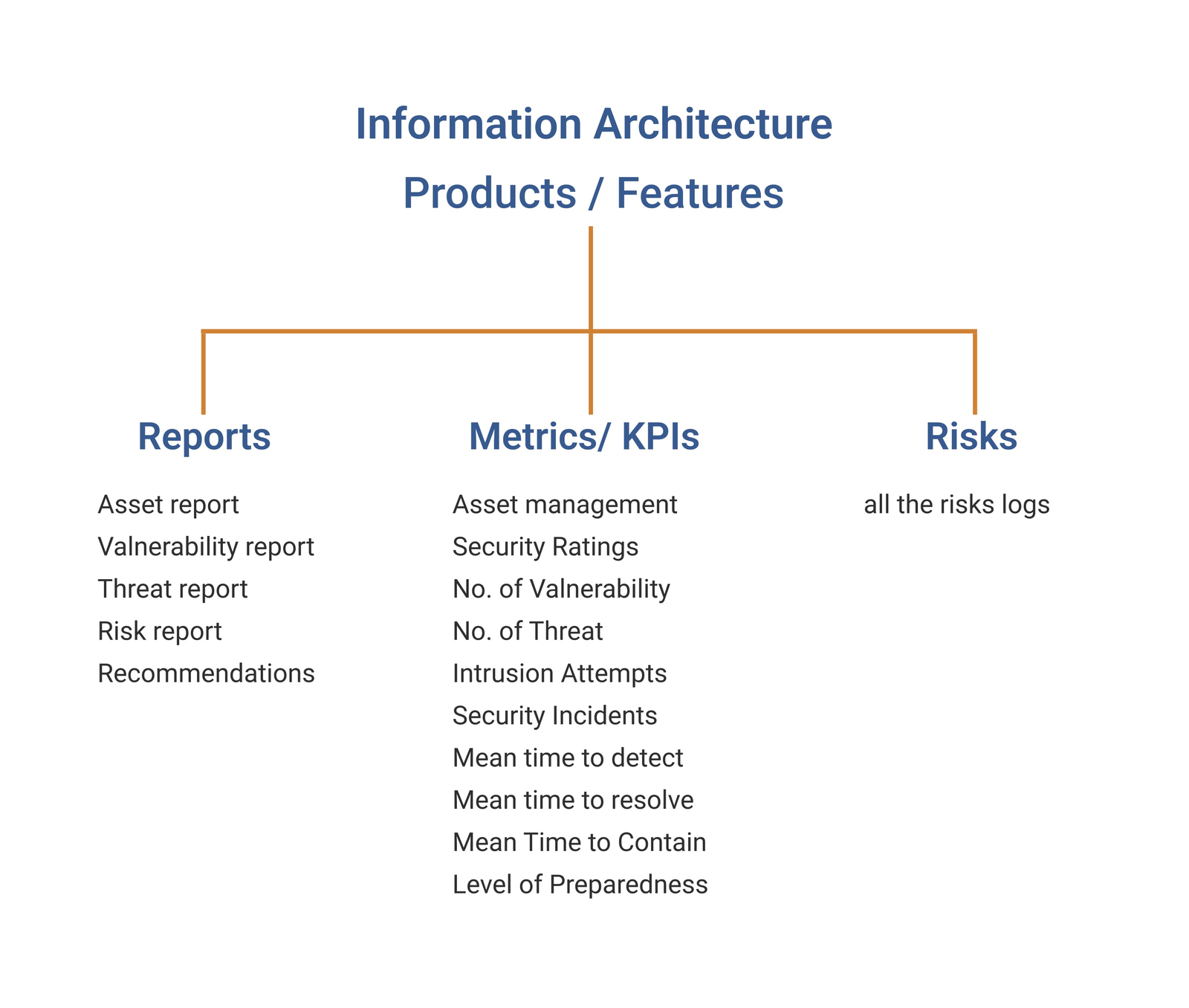
IA, wireframes & UI kit
A documented design system and mid-fi wireframes
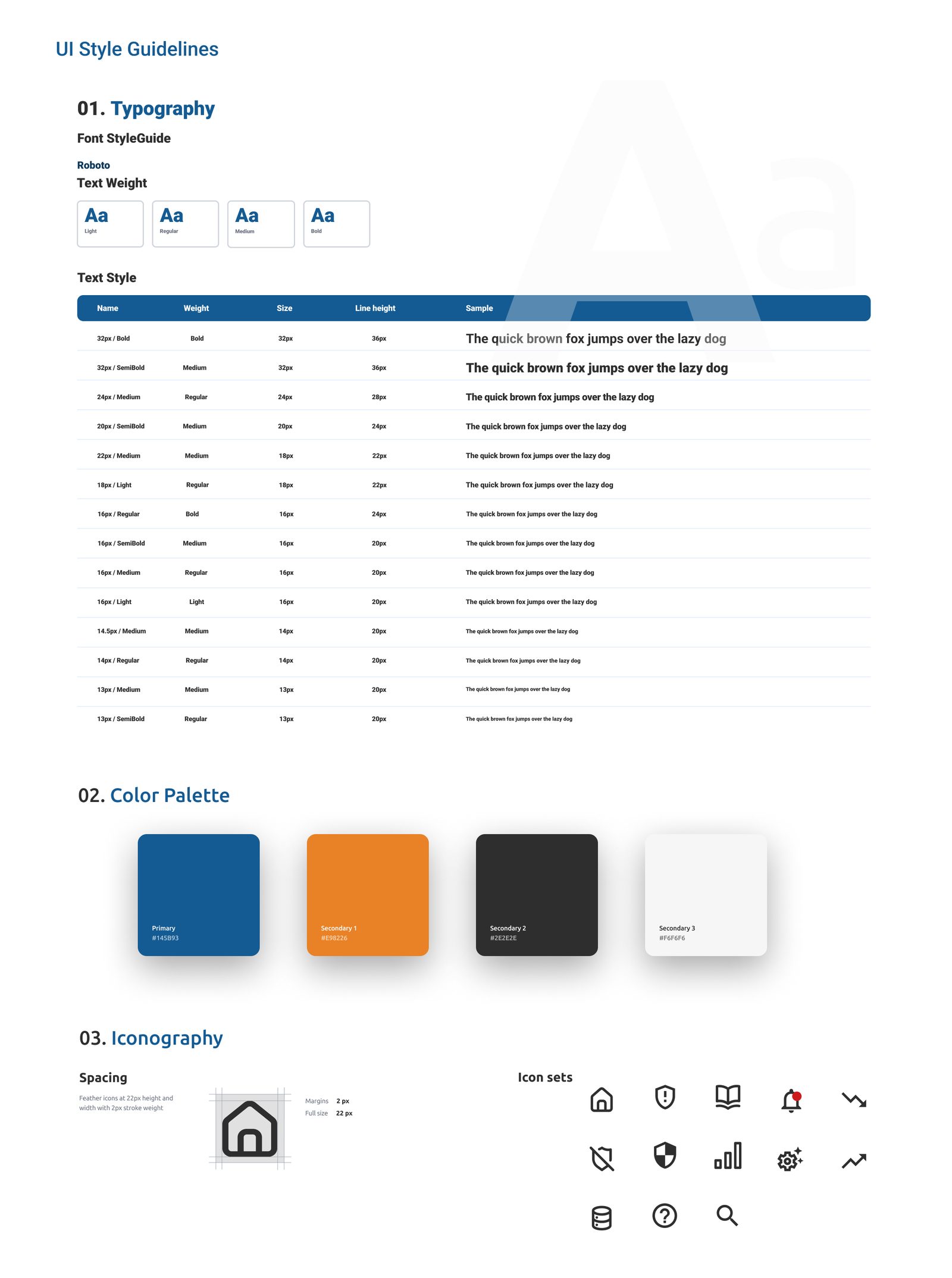
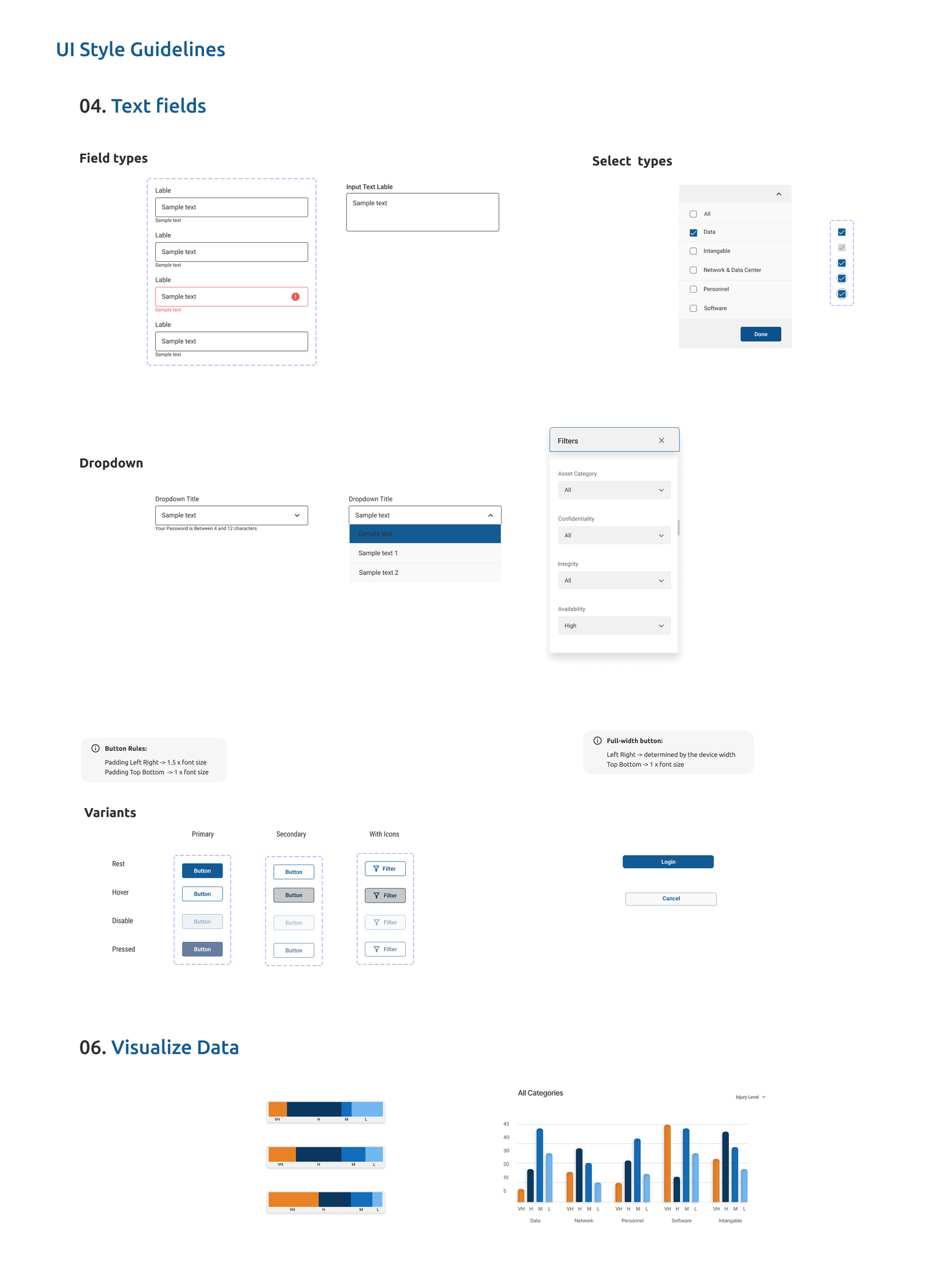
I built a design system of UI components with documented states, then worked through mid-fidelity wireframes to explore layout, content separation, and easy-to-edit exchanges. The clear logic and minimalist page design, coupled with a thorough design system, reduced development time by 30%.
Testing & delivery
A/B tested, validated, and handed off
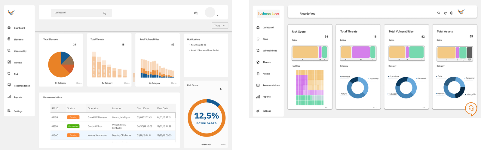
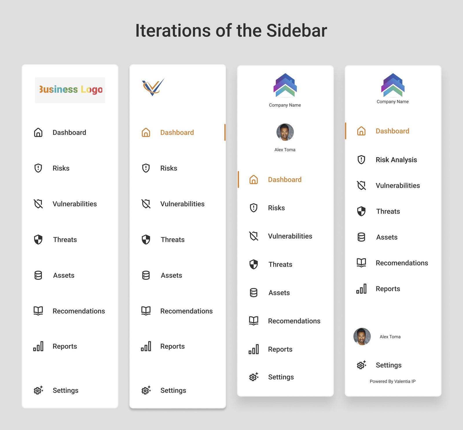
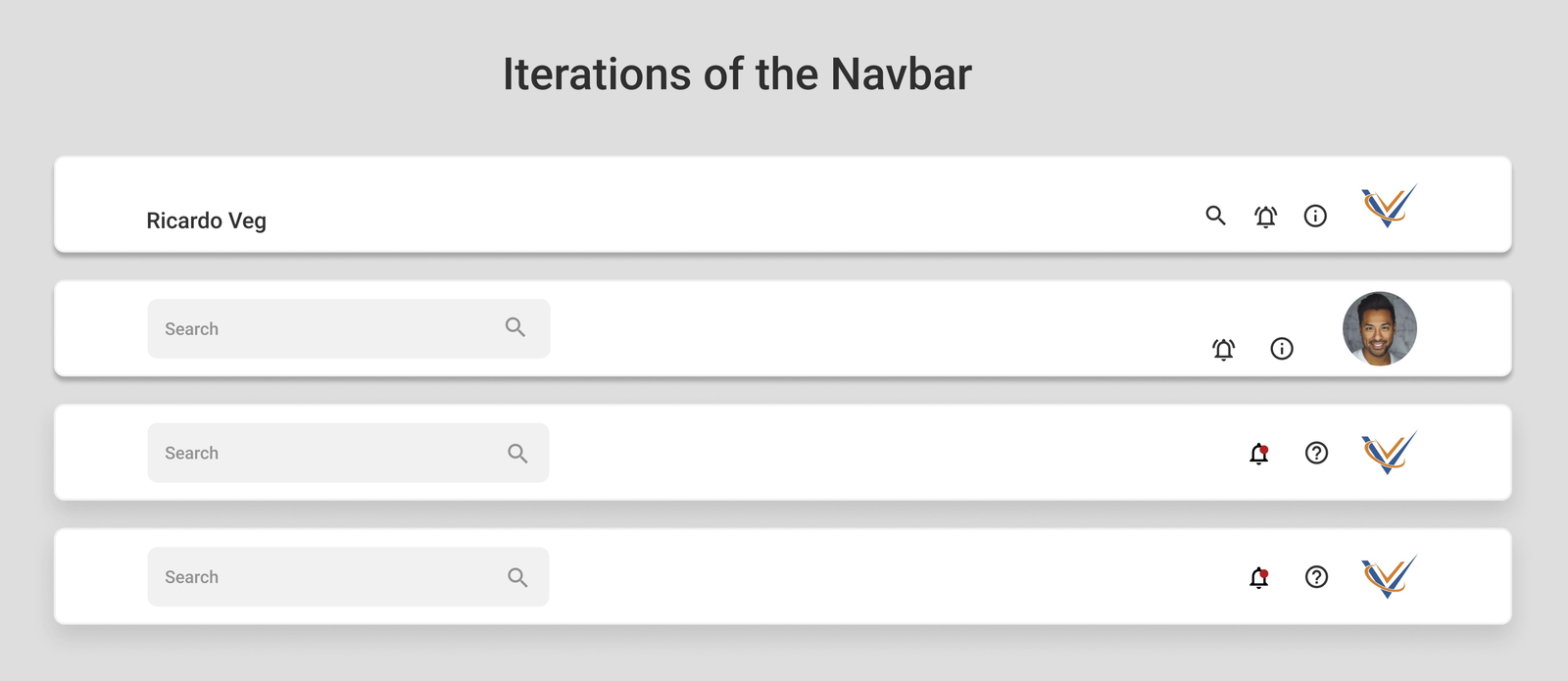
Two high-fidelity prototype directions were A/B tested, then validated in moderated sessions with 6 participants who reviewed cyber metrics and reports, added assets, and connected assets to related risks. Observing where they navigated showed what worked and what didn't, and the prototype was iterated where functionality was missing before final handoff to stakeholders.
Next steps I'd take it: develop the interaction design further, design a mobile version, and explore an AR/VR virtual-try experience for the assessment workflow.
Reflection
This project taught me how to solve for a specific problem that has to work for technical and non-technical users simultaneously, and how to manage time across many rounds of iteration and testing. Documenting every step and achievement was what made the research usable by the rest of the team rather than trapped in my head.
Outcome
Delivered
Final version handed to stakeholders with a before/after comparison.
30% faster development
Minimalist page design plus a thorough design system cut build time.
Dual-audience clarity
One dashboard serving both technical analysts and non-technical clients.