Kids First · B2C product · 0→1 product design
Turning fragmented co-parenting into one child-centered coordination experience
Defining a connected product ecosystem for schedules, child information, shared memories, and communication — then building the design system needed to scale it.
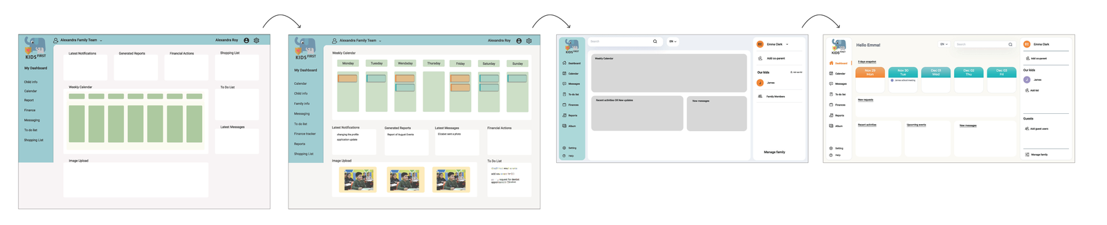
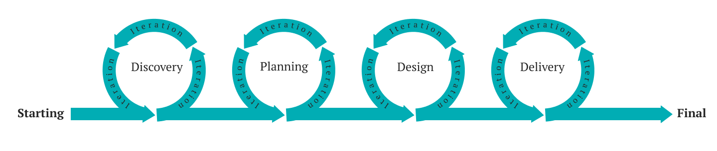
Approached with the Double Diamond
Overview
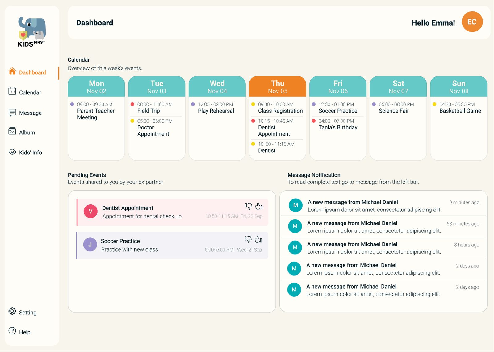
Separated parents coordinate children's schedules, appointments, routines, and updates through a mixture of texts, personal calendars, emails, and verbal reminders. That fragmentation creates three problems: information gets missed, responsibility becomes unclear, and communication that is already sensitive becomes harder. Kids First explored a different model — a shared, child-centered coordination platform where co-parents manage the practical information around their children while keeping appropriate visibility and control. My work moved from feature definition and interaction design into the reusable patterns and design-system foundations the product needed as it grew.
Research
Co-parenting required more than another calendar or messaging app
Three interviews with divorced and separated parents at different life stages, plus a daughter raised between two households, informed the direction — building on permitted 2019 research from a Carleton University student group and their supervising lawyer. The data underlined how frequently custody arrangements involve conflict, and where product structure could lower it.
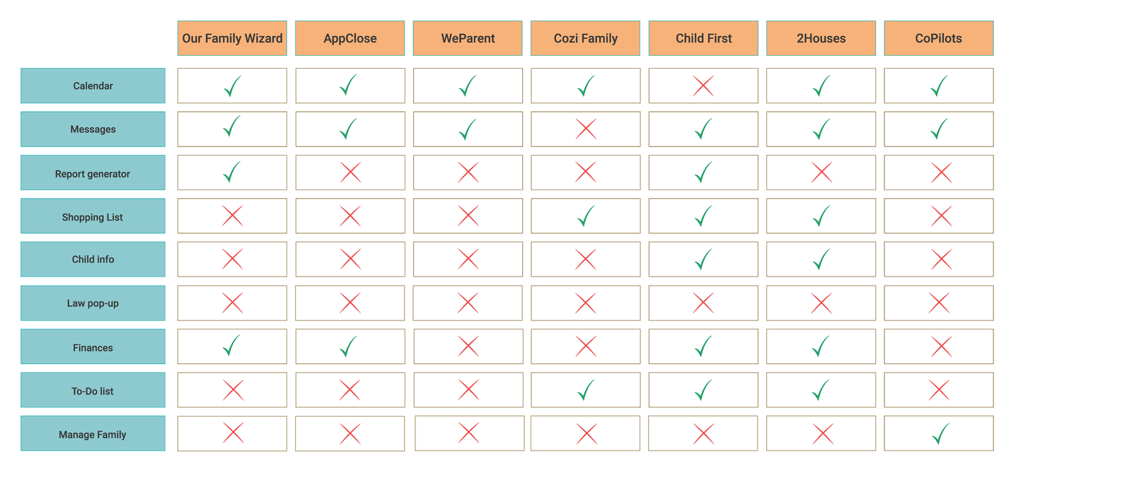
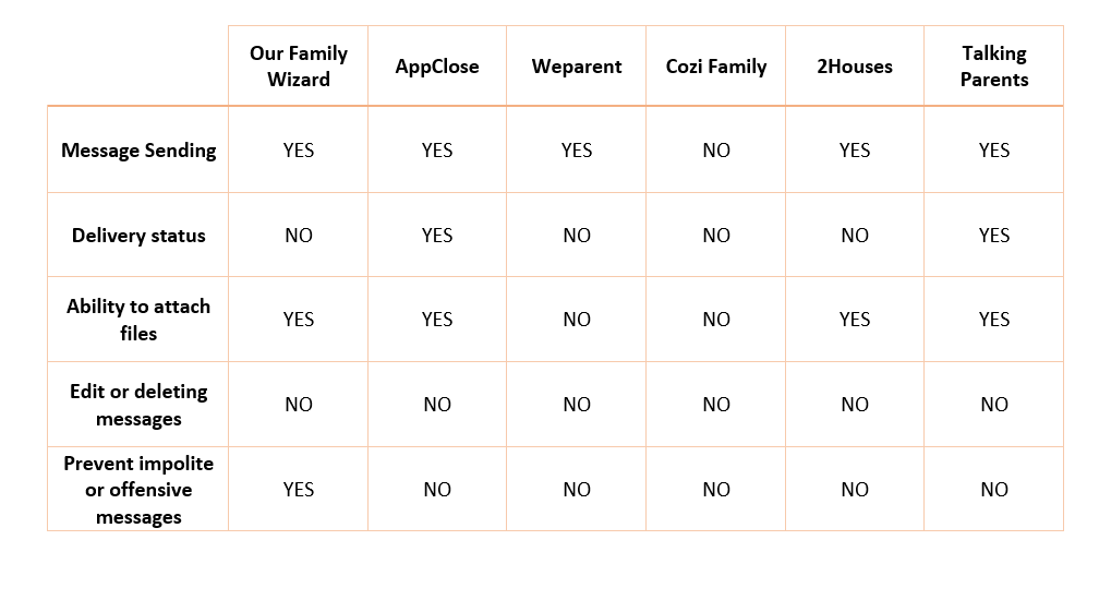
Competitive analysis showed the market converging on the same core: finance tracking, custody tracking, a child-info repository, and a calendar — mostly as mobile apps. The gap was not more logistics tooling. It was calmer communication and child-centered simplicity.
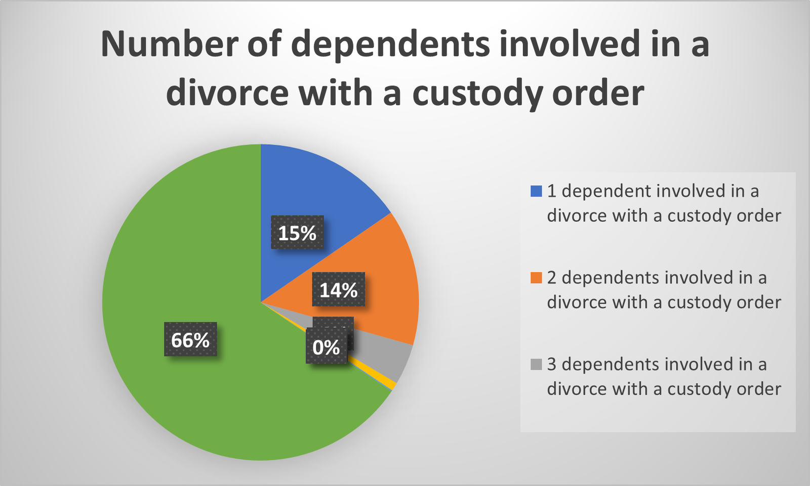
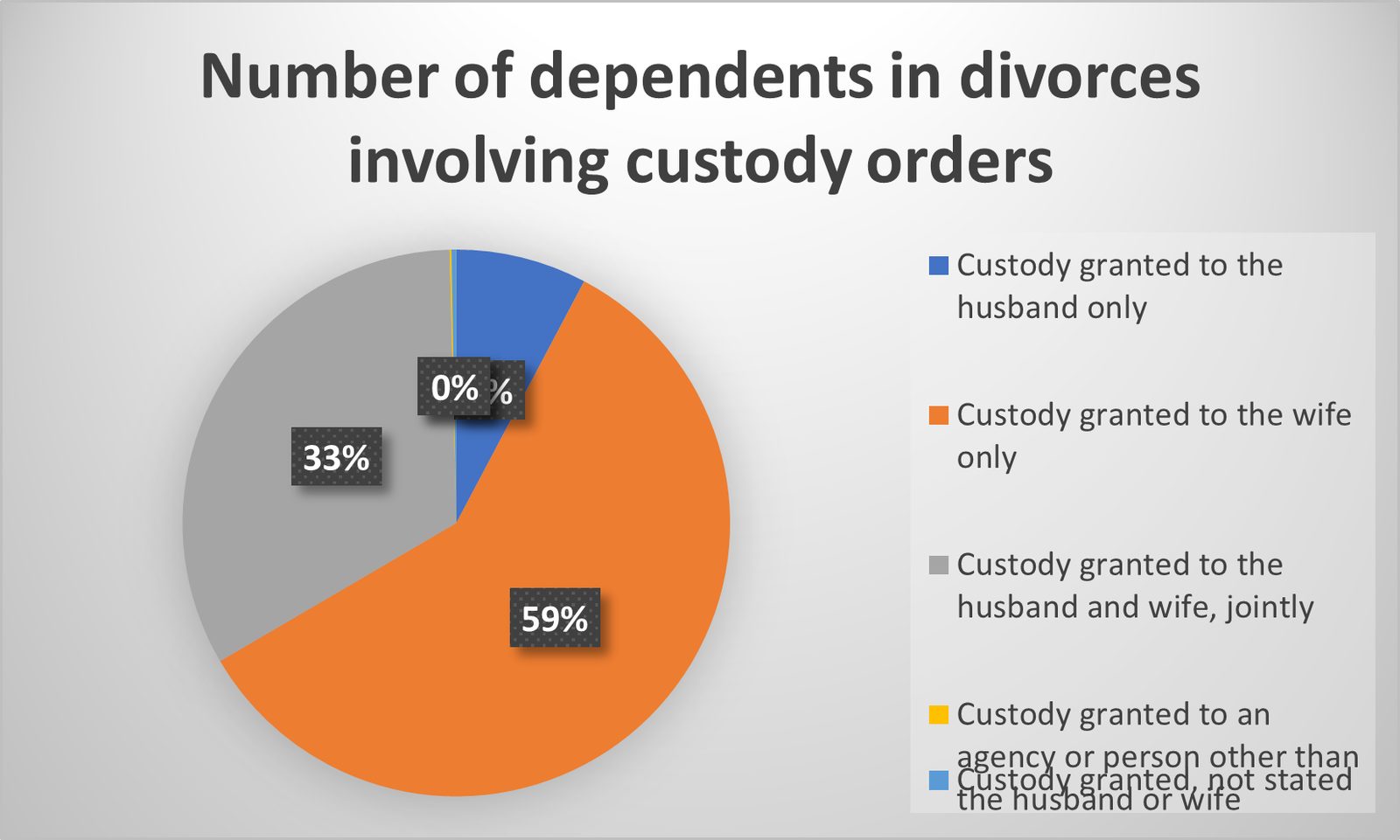
Forums were the feature participants most avoided; they wanted immediate, authoritative answers rather than a community to debate them with. That finding removed a feature from scope and replaced it with structured guidance.
Product strategy
The opportunity wasn't to build more tools — it was to connect the information families were already managing
Three principles connected the features and settled most subsequent arguments about scope.
Keep the child at the centre
Organize information around a child's needs rather than around disconnected utilities.
Make responsibility visible
Parents should be able to see what has been arranged and what still needs attention, without asking each other.
Reduce communication friction
Use structure — and where appropriate, assistive AI — to reduce ambiguity without taking control away from parents.
Feature definition
Four connected experiences turned coordination into a shared system
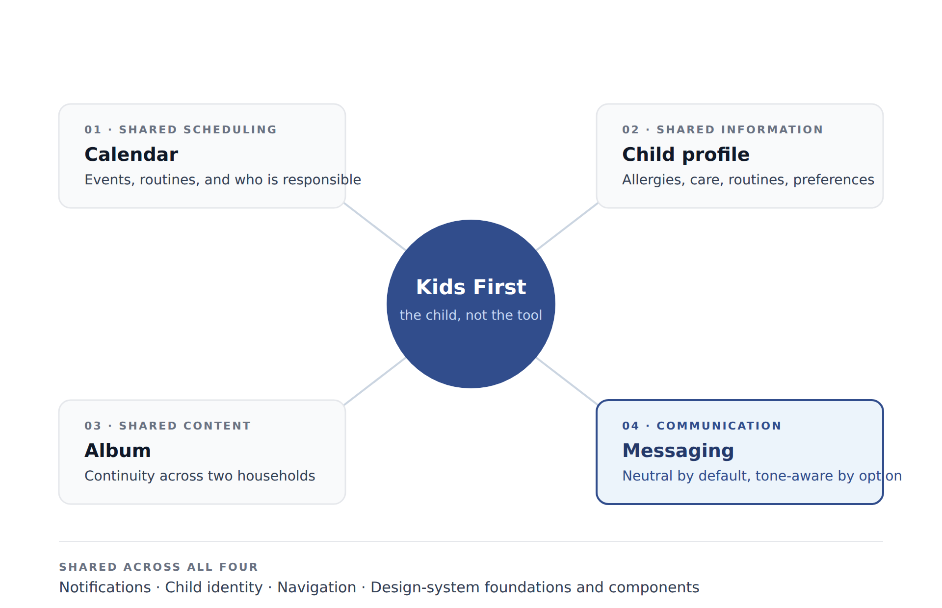
Rather than four utilities sharing a login, the product was defined as one coordination model with four surfaces onto it — each anchored to a child, and all supported by the same notification, identity, and navigation patterns.
Shared scheduling & child information
Important child information needed one reliable home
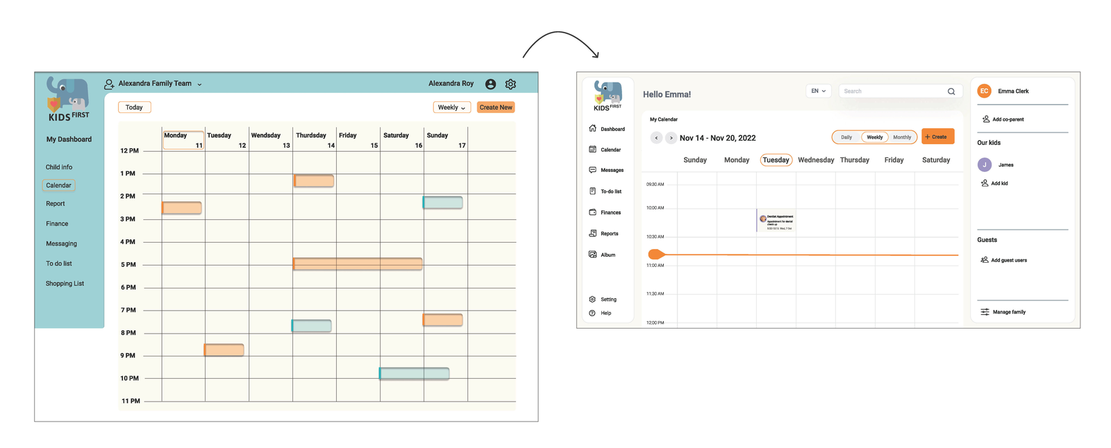
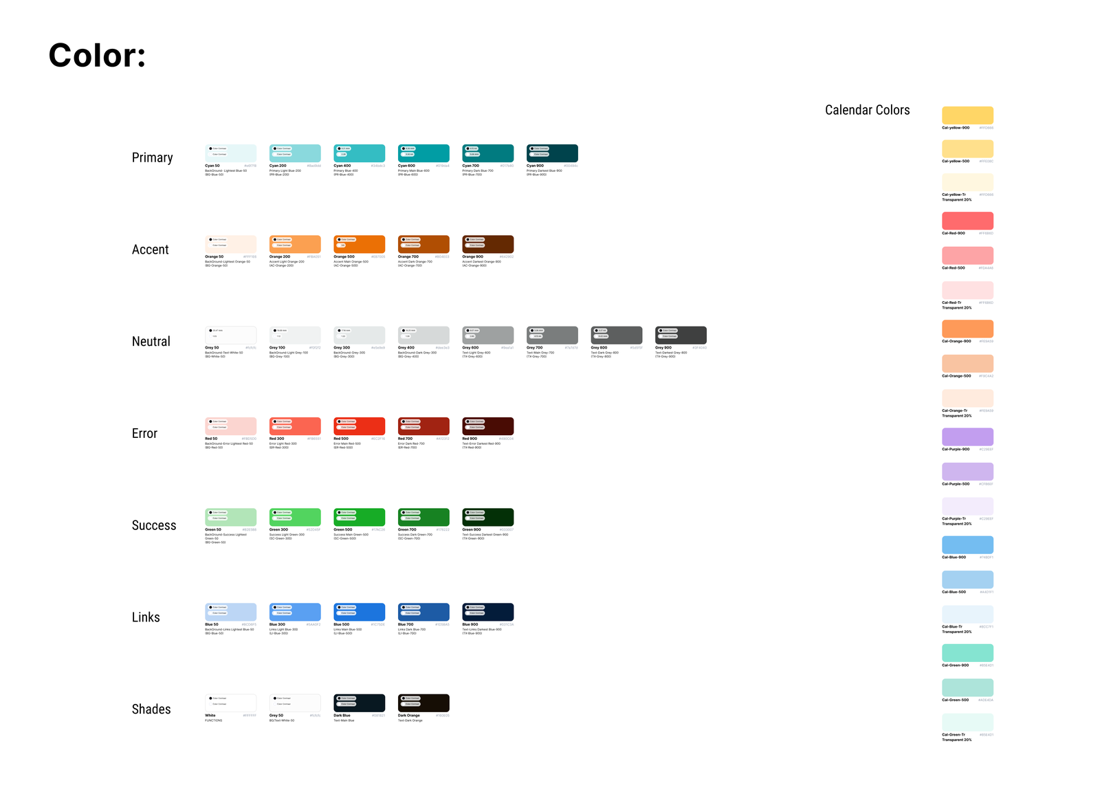
The calendar handles events and routines across two households, with colour distinguishing children so a shared week is readable at a glance — supported by a status treatment rather than colour alone, so the meaning survives for colour-blind users.
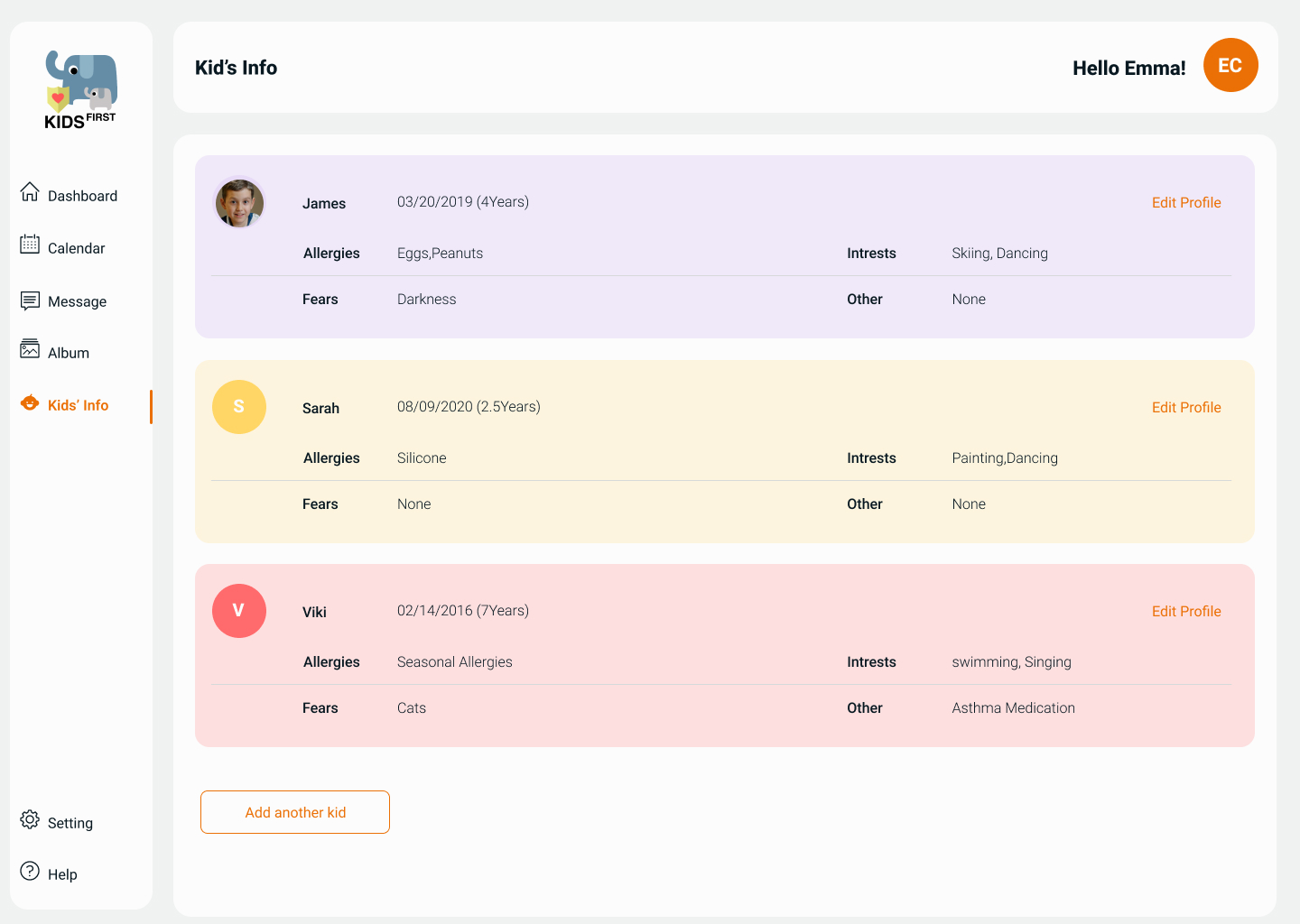
The child profile answers a narrower and more useful question: what should both parents be able to rely on without searching back through old conversations? Basic details, allergies and care information, food preferences and routines, and the things a child actually likes. Album gives shared photos and memories a home so content stops being exchanged through messaging.
Communication
Messaging needed to support coordination without amplifying conflict
Direct co-parent communication is where the product's risk concentrates. Messaging was designed to be neutral by default — factual, in context, and paired with law pop-ups that surface relevant Ontario family-law and child-health guidance at the moment it becomes relevant, so parents aren't left guessing at their obligations.
Messaging first shipped with a static tone indicator on composition. What it became is below.
AI-assisted messaging
AI could create a moment of reflection without deciding what a parent should say
The tone meter wasn't a late addition. It was named in the original product brief alongside the interactive calendar, the dashboard, and the law pop-ups — one of four things the app was meant to do.
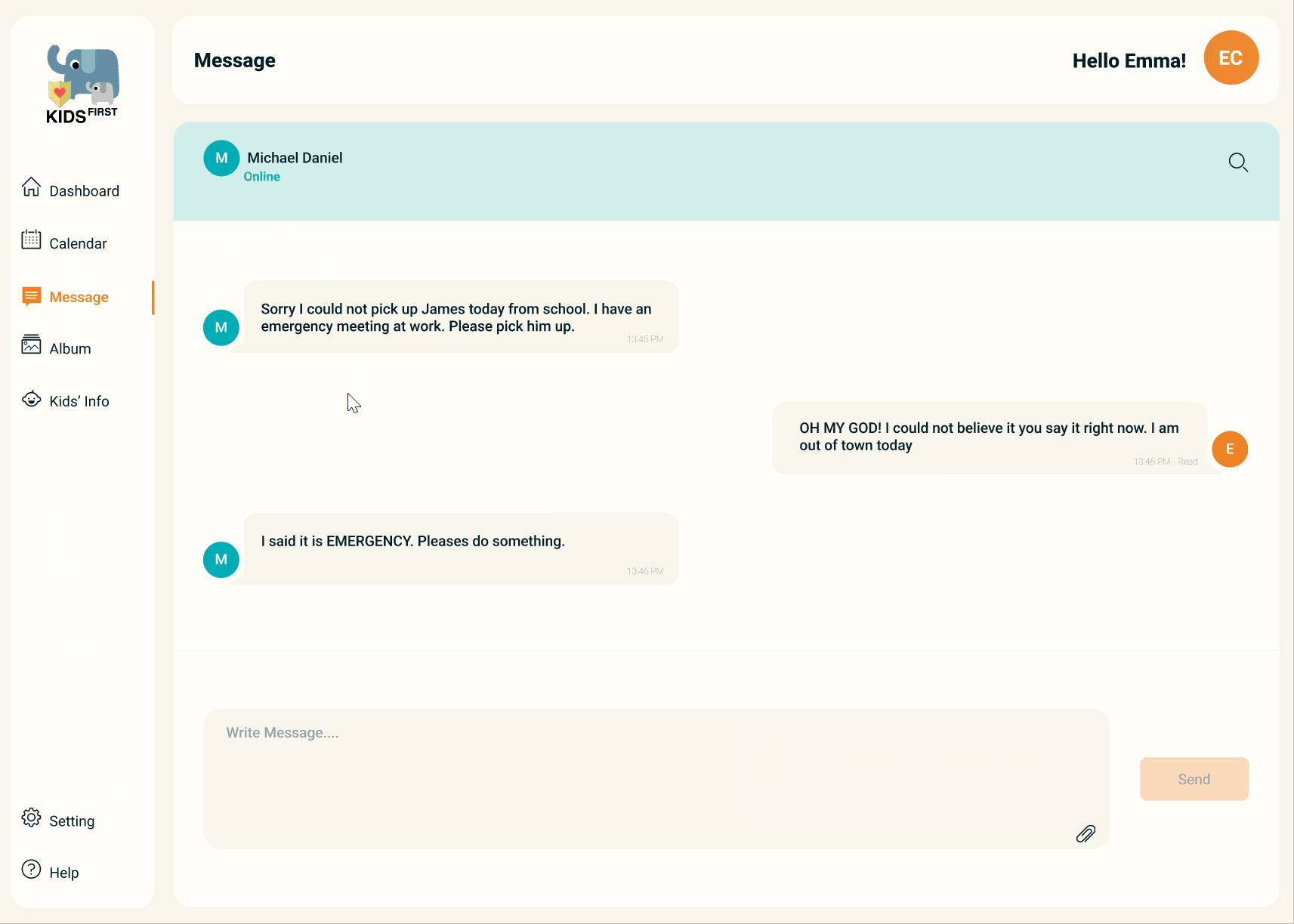
The competitive analysis is what gave it urgency. Across six co-parenting products, not one let a parent edit or delete a message after sending, and only Our Family Wizard attempted anything at all to catch impolite or offensive wording. A message sent in anger was permanent and unmediated, inside a product whose entire premise is lowering conflict between two people already in it.
I was assigned to develop the NLP model that would take messaging from a static tone indicator into tone-aware assistance. The framing question mattered more than the model: in a conversation between two people in conflict, what is an assistant actually for?
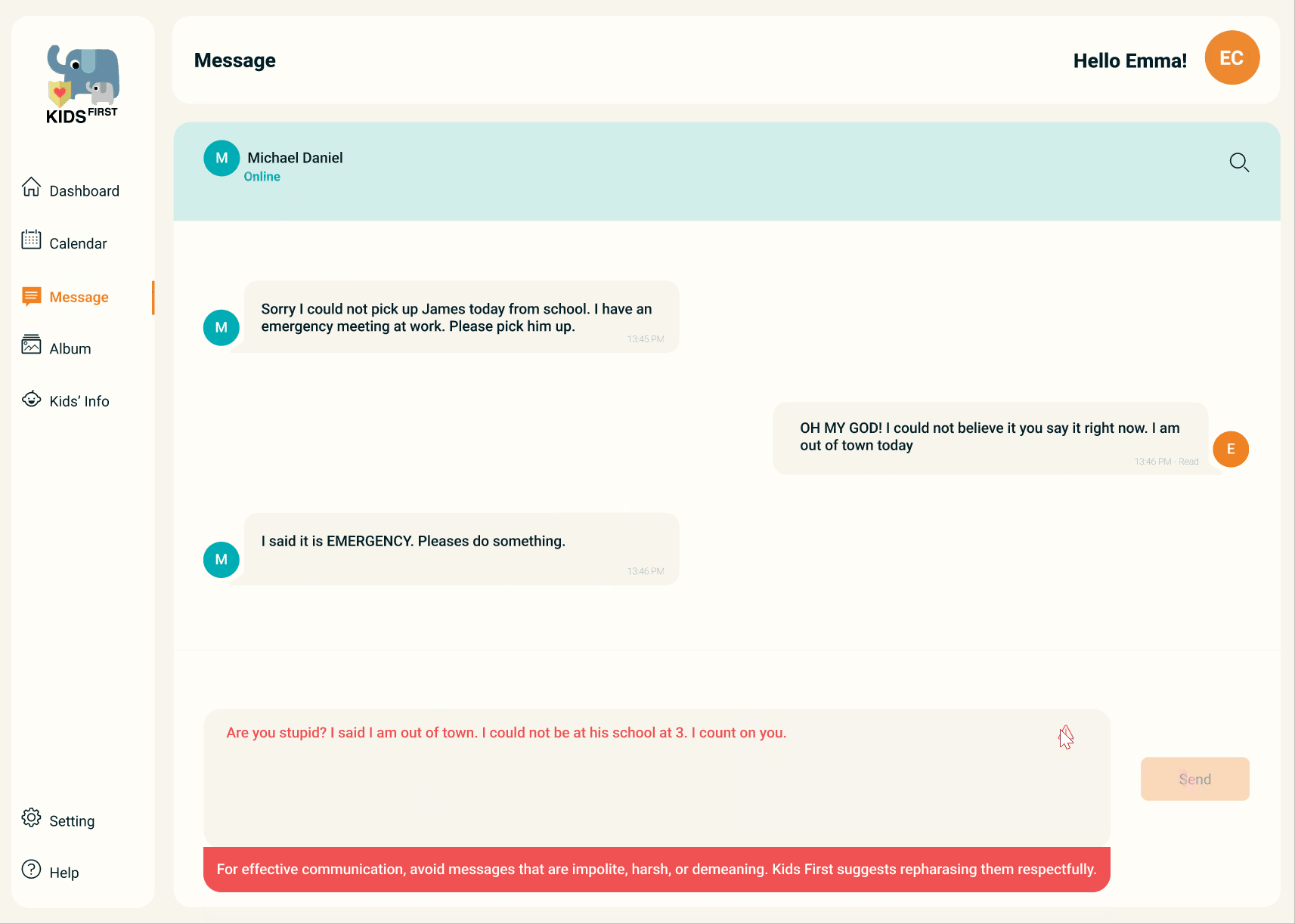
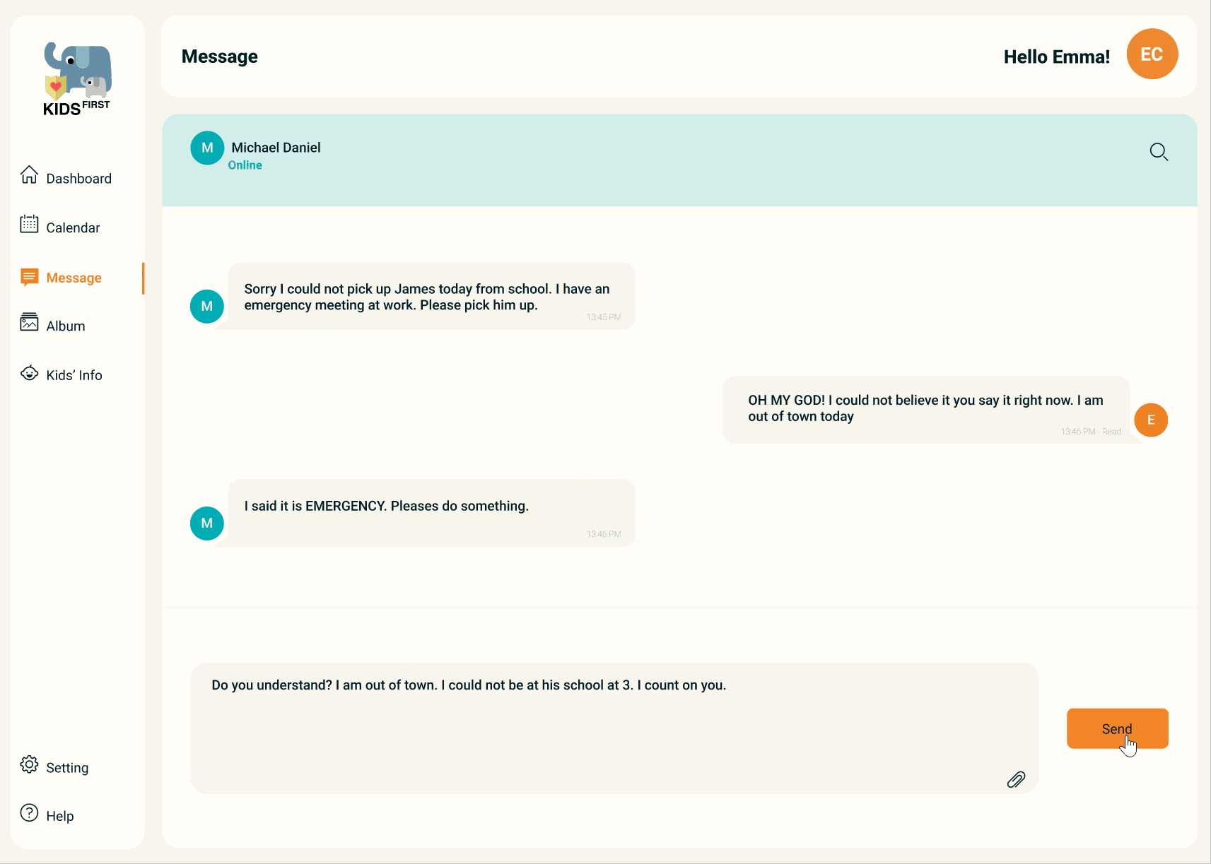
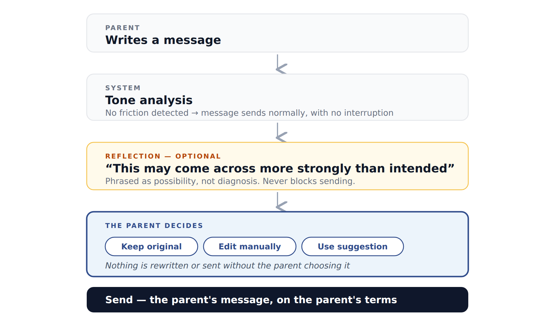
Not to write the message. What shipped flags the phrasing, names the reason in plain language — impolite, harsh, or demeaning — and holds the send until the parent has rewritten it themselves. The system never proposes replacement wording, so what finally goes out is always the parent's own sentence.
Gating the send is a strong intervention, and it was the most argued-over decision in the feature. A passive indicator is easy to ignore in the exact moment it matters most; blocking creates a real pause. What it must never do is decide the words.
AI supports the conversation. It does not take ownership of it.
Product guardrails
The assistant reduces unnecessary escalation without changing the parent's intent
In a domain where a message can end up in a custody file, the constraints matter more than the capability. Most of these rules define what the system must not do — and they were written before the model, not bolted on after it.
Don't diagnose emotions
Not “you are angry.” Instead: “this message may come across more strongly than intended.”
Don't label people
No aggressive, toxic, or unreasonable. The system describes text; it never characterizes a parent.
Don't alter factual meaning
Rewrites preserve dates, names, plans, responsibilities, decisions, and child-related information.
Never silently replace or send
The parent sees and approves the final message every time.
Disagreement is not misconduct
The feature supports reflection. It is not a communication policing system.
Communicate uncertainty
States are no intervention, reflection suggested, alternative available, or dismissed — never “negative tone detected” presented as fact.
System thinking
The features became more useful when they stopped behaving like separate tools
The connections are what made this a product rather than a suite. A child profile supplies context to the calendar and to conversations. An album entry belongs to a child, not to a folder. A message usually concerns a schedule, a responsibility, or a child — so the same identity, notification, and status patterns had to hold across all four surfaces.
That requirement is what made a design system necessary rather than nice to have: the features needed to share one mental model of children, responsibilities, and status.
Design system
As the product expanded, screen-by-screen decisions stopped scaling
Calendar, profiles, album, messaging, onboarding, and notifications produced the same interaction patterns repeatedly. Without shared foundations, similar interactions drift apart visually and behaviourally — and every new feature reopens decisions that were already made once.
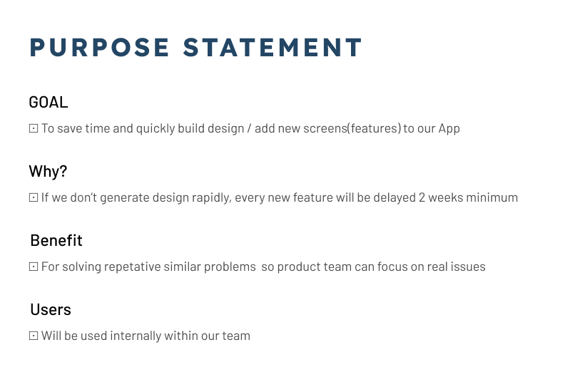
I opened with a purpose statement the whole company could agree on rather than a component audit: save time building new screens, stop solving repetitive problems so the product team can focus on real ones, and establish a shared internal language. Then a UI inventory with four designers turned a vague sense of inconsistency into a prioritized backlog scored by impact and effort. Buy-in was its own deliverable — a company-wide kick-off, engineering involved before components existed, and progress shared openly — because a system nobody adopts is just a second place to look.
Foundations
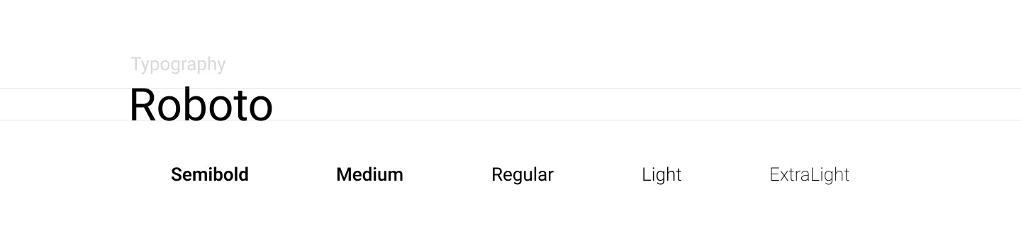
A colour system with primary, accent, neutral, semantic, and a dedicated calendar palette; a typographic scale; spacing; iconography; and the interaction states every component inherits.
Components
Buttons across rest, hover, pressed, and disabled in primary and secondary; text fields across default, active, valid, error, and disabled; plus cards, navigation, modals, and messaging patterns.
Product patterns
Child identity carried consistently across profile, calendar, album, and messaging; calendar event and assignment states; message states. The domain patterns a generic library would never contain.
Governance
Naming conventions, booleans set at parent level, variants limited to style changes with structural changes as separate components, documented anatomy and spacing, and a creation checklist.
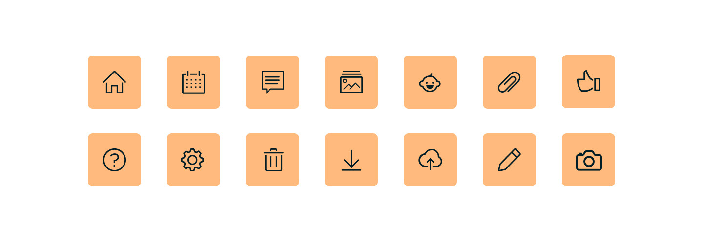
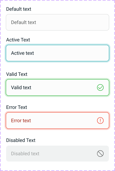
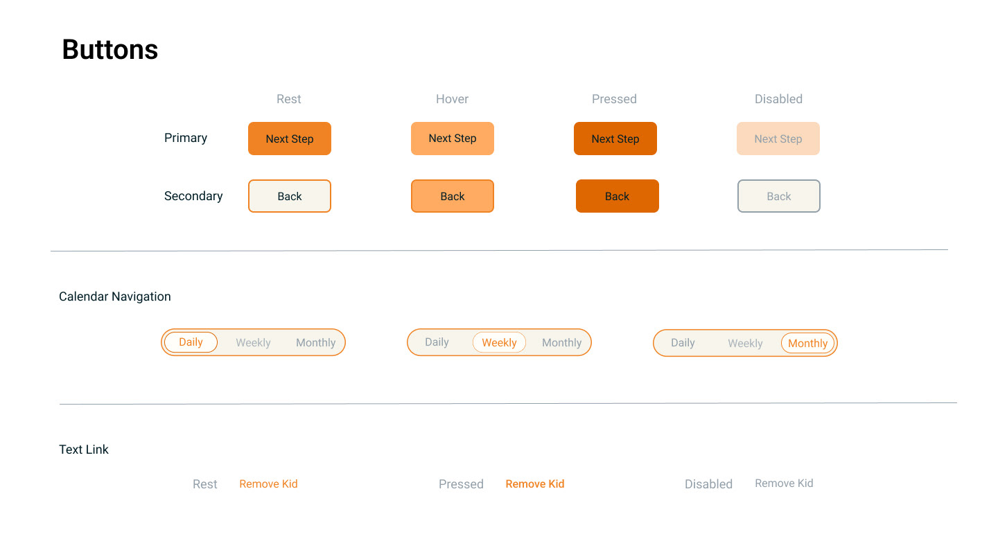
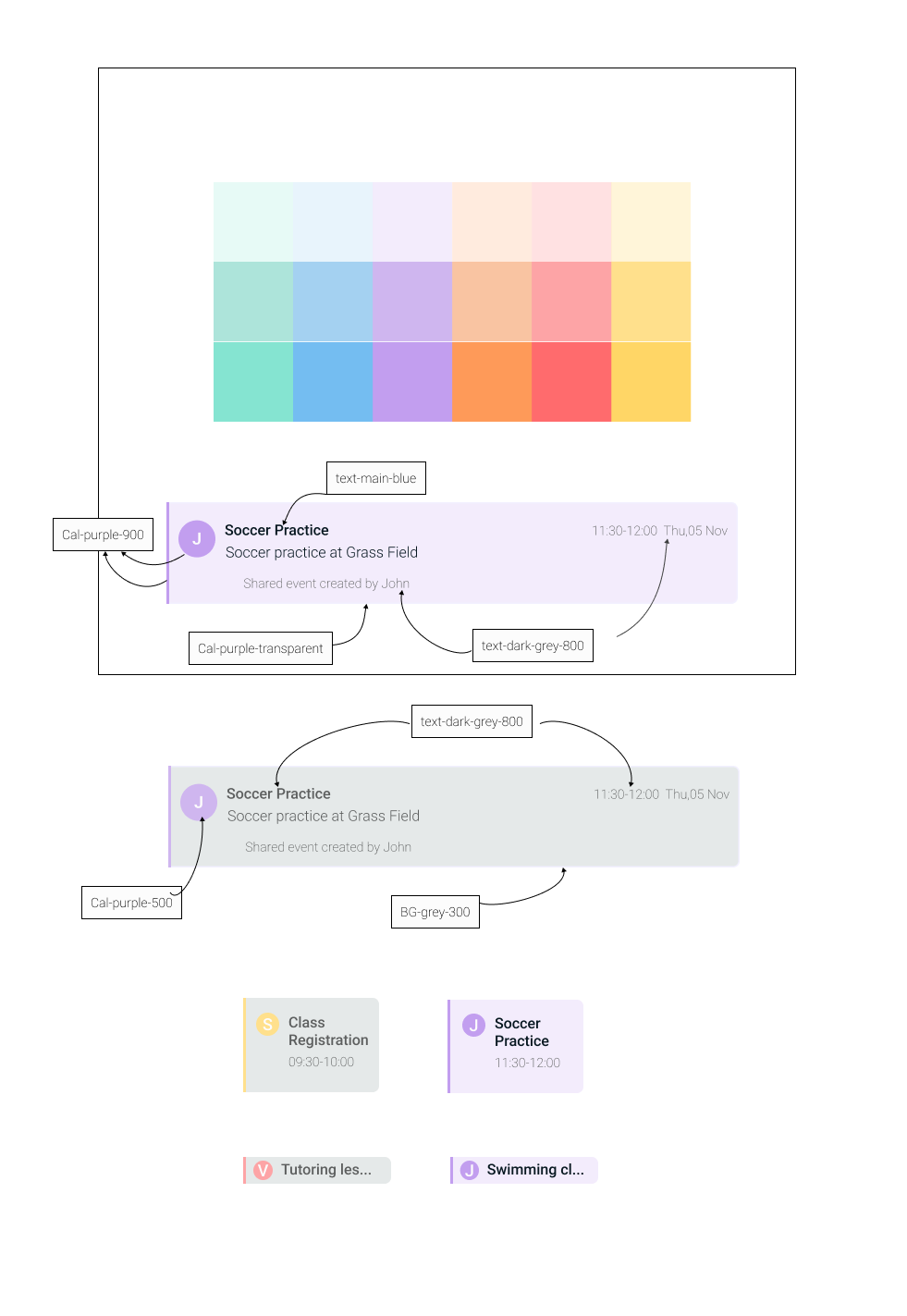
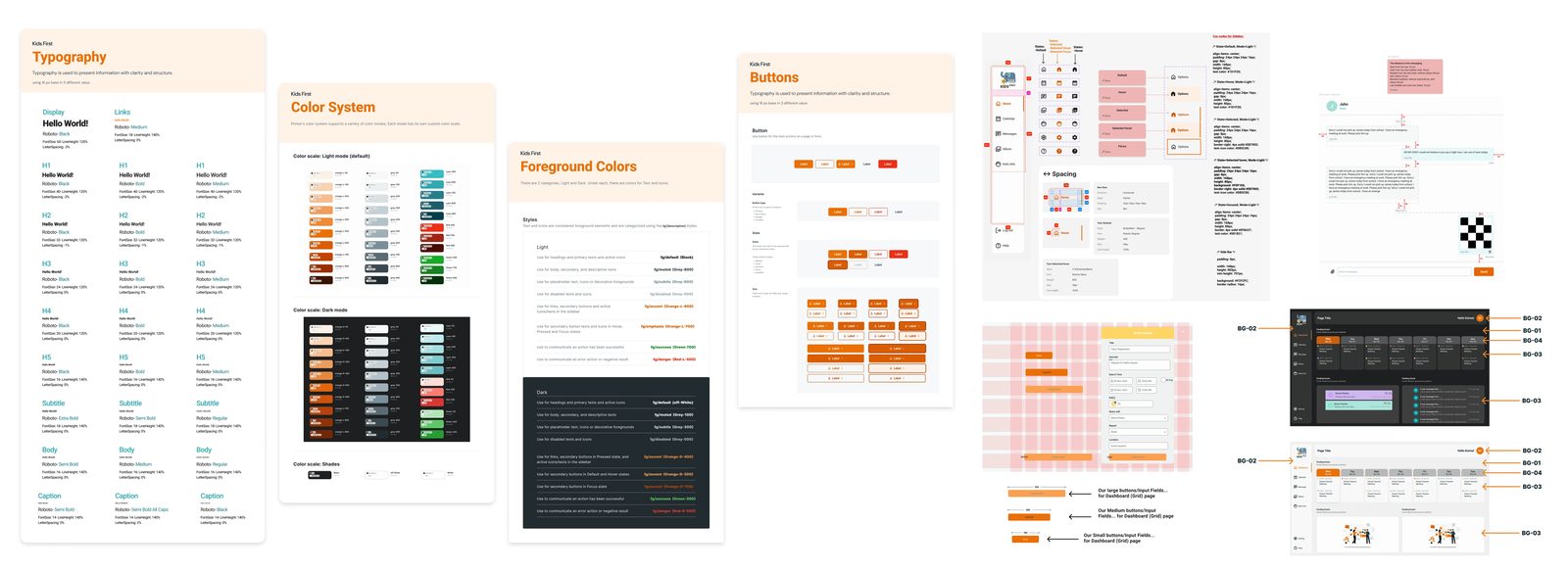
The component creation checklist is the part that made it extensible: proper naming, booleans set at parent level, variants limited to style changes with structural changes handled as separate components, documented anatomy and spacing, and prompt publishing so the library never lagged behind the product.
Validation
Assistance had to feel optional, neutral, and reversible
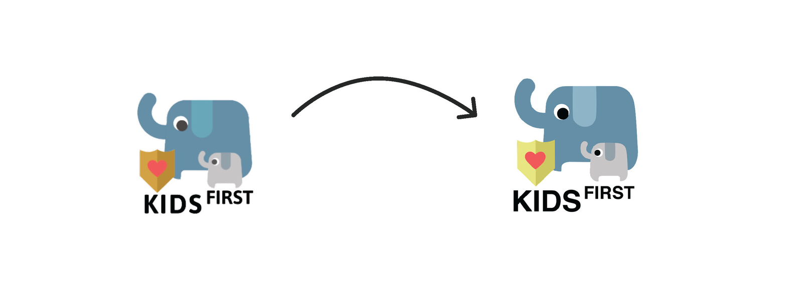
Usability testing drove several rounds of iteration — the logo, the child-info screen, and the dashboard all changed in response — and a calendar A/B test settled the interaction model. The recurring finding was that simplicity and intuitiveness matter most in a content-heavy product used by people whose time and patience are already stretched.
Reflection
The strongest system wasn't the component library — it was the relationship between the features. Calendar, child information, album, notifications, and messaging all needed to share the same mental model of children, responsibilities, and status, and building the design system alongside the product is what turned those recurring decisions into reusable patterns rather than repeated ones. Building the tone-aware layer reinforced a principle I now apply to any AI-assisted product: automation should reduce effort or friction without removing meaningful user control. In a sensitive domain, deciding what the system should not do is the more consequential design decision.
Outcome
Connected coordination
Core parenting activities brought into one shared product model instead of isolated tools.
Centralized child context
Child information and shared content given dedicated, structured spaces.
Scalable product language
Reusable foundations, components, and governance created consistency across features.
Responsible AI in a sensitive domain
Tone-aware assistance built on guardrails that keep the parent the author of every message.