Design system · Enterprise platform · Design-to-engineering
Scaling complex enterprise tables through a reusable design system
Aligning Figma components with AG Grid to improve consistency, accessibility, and design-to-engineering delivery
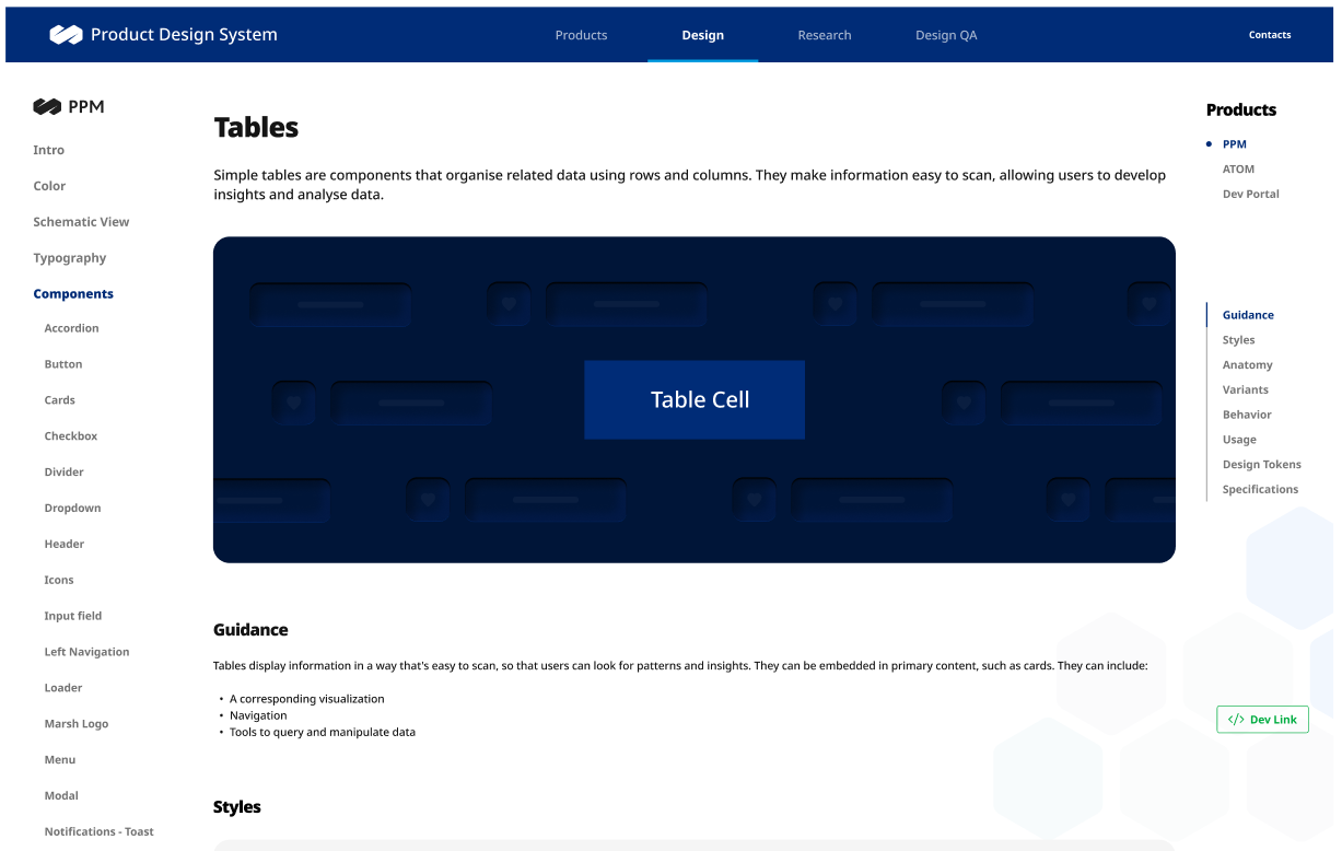
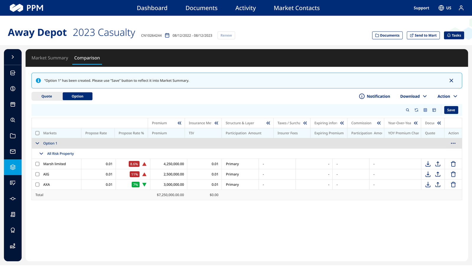
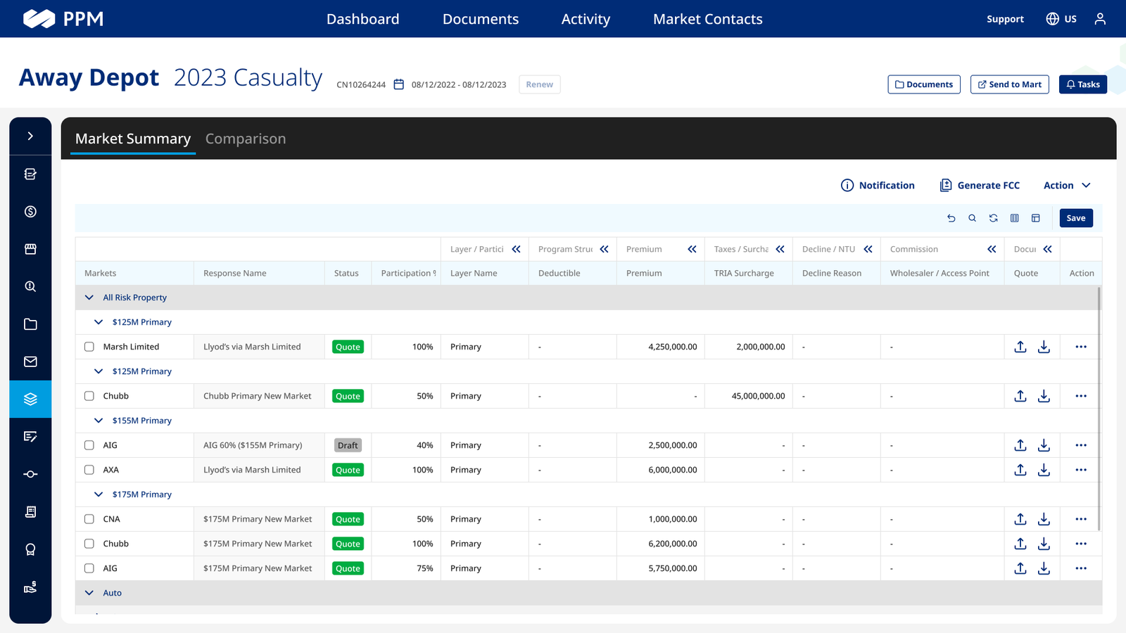
At Marsh, I led the design and implementation of a reusable Table Cell component supporting the Market Summary feature in the PPM platform. We leveraged AG Grid — the data grid framework used by our developers — and I ensured seamless design-to-engineering integration through careful component alignment.
Approached with a design-system process
Overview
This was part of a broader initiative to deliver dynamic, scalable, insight-driven views for business leaders tracking market performance across lines of business, regions, and time frames. Rather than force a research framework onto it, I ran it as a four-step design-system process — audit, strategy, technical alignment, and a test-and-feedback loop.
Product discovery & audit
Finding the inconsistency
I mapped requirements and inconsistencies across the PPM data-table UIs, then evaluated AG Grid's capabilities for custom rendering. Different modules had grown their own table conventions, slowing teams down and confusing users moving between them. Market Summary needed conditional styling, dynamic rows, and trend indicators at enterprise scale.
Component design strategy
Flexible variants for every data type
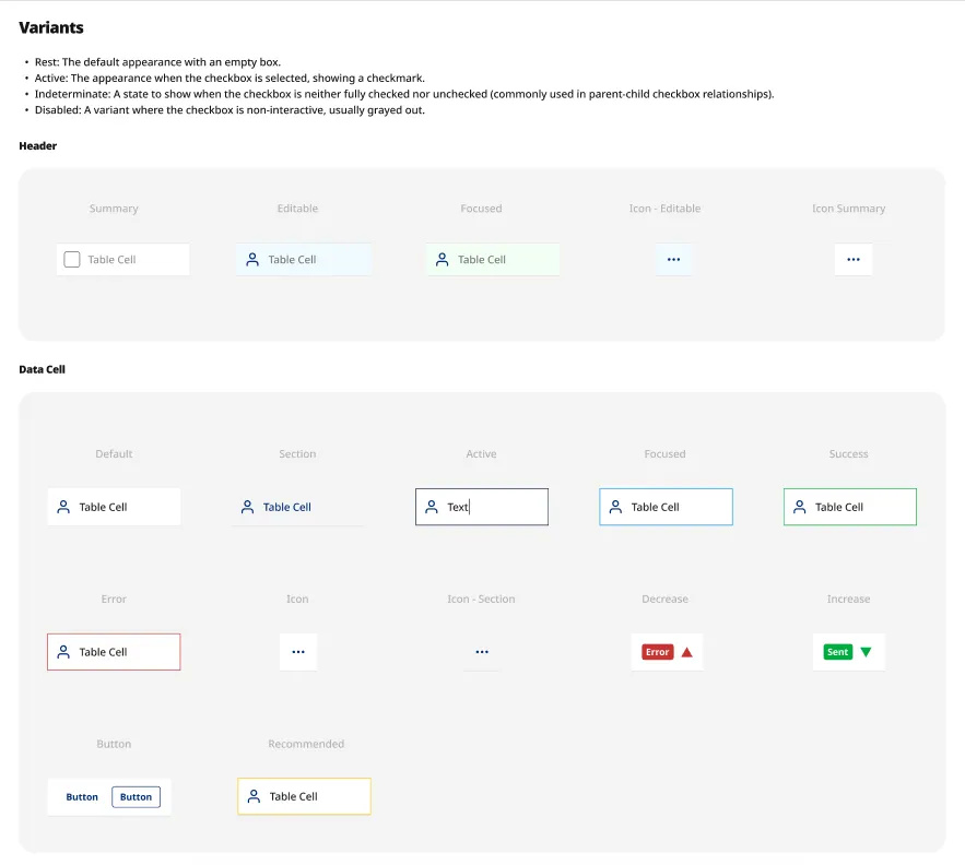
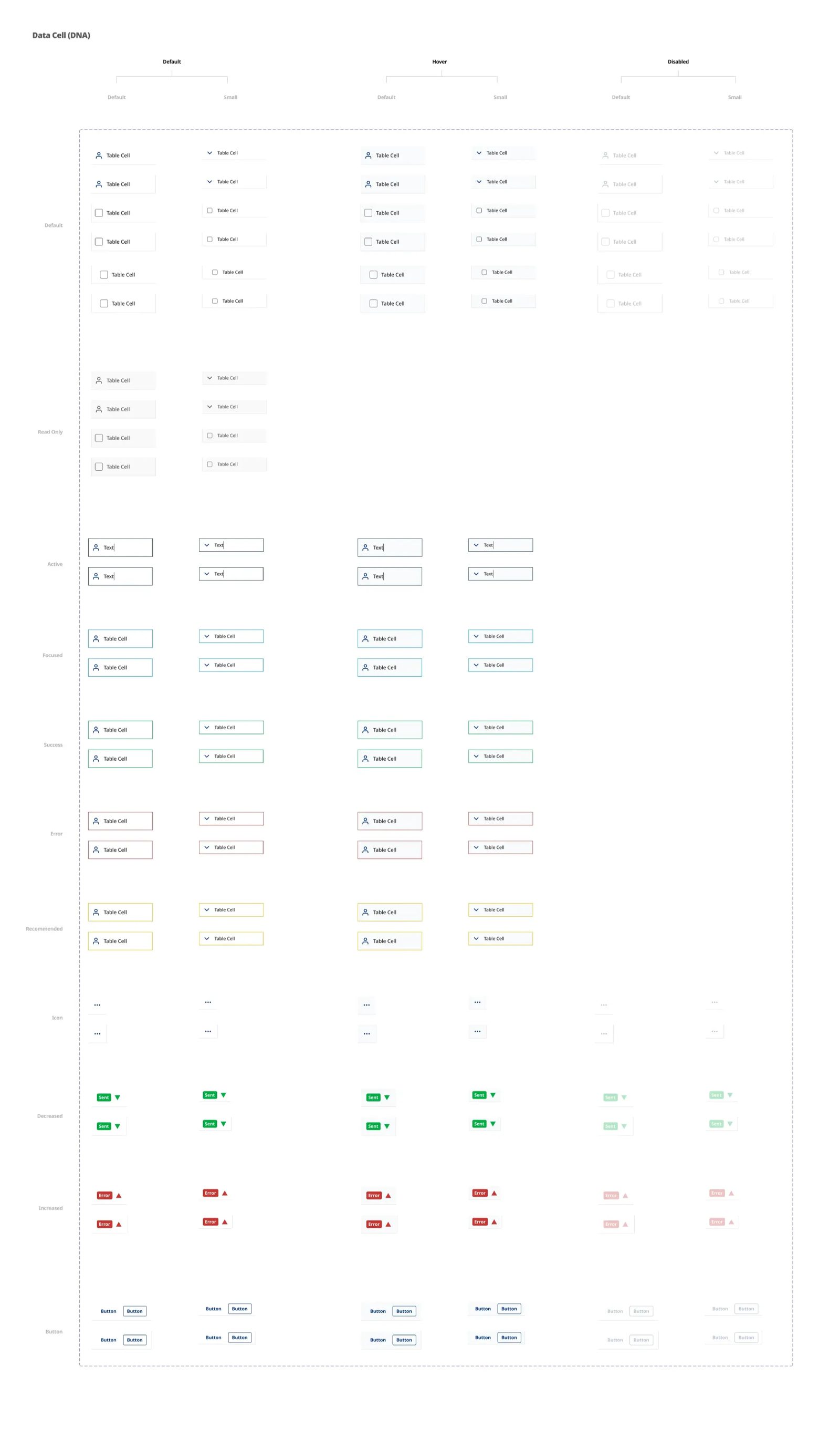
I created flexible Figma component variants — status indicators, inline icons, selection/hover/expandable rows — designed with modularity to support monetary, categorical, boolean, and temporal data. Building for reuse from the start meant the component could absorb new data types without a redesign.
AG Grid technical alignment
Design tokens into the developers' framework
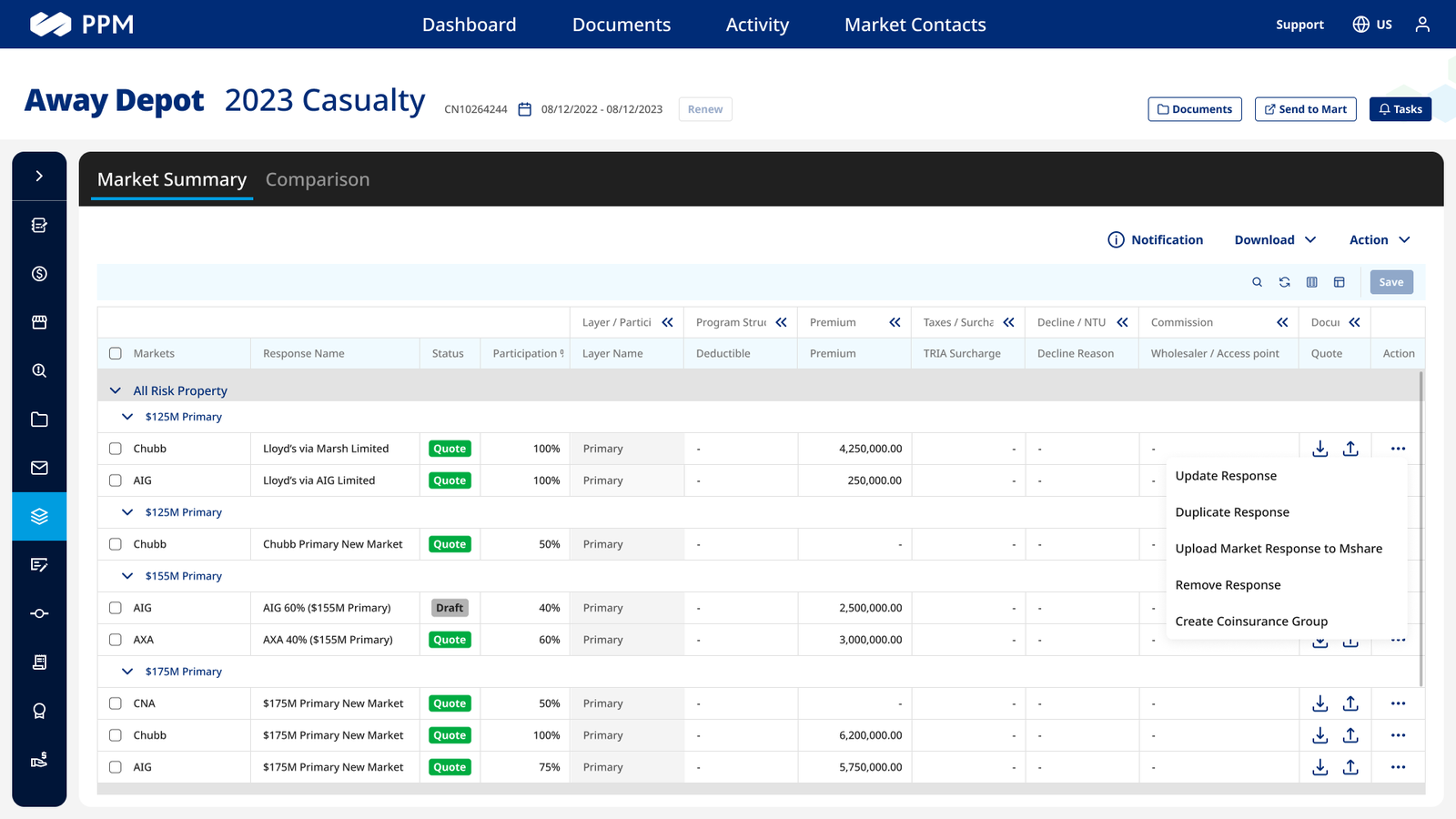
Working with developers, I integrated design tokens into AG Grid theming and built reference prototypes for custom cell renderers, expandable row logic, pinned columns, and row groupings — so the component set lived where the engineers already worked, not beside it.
Test & feedback loop
QA, accessibility, and adoption
Storybook demos supported component QA, an accessibility review covered focus states and screen readers, and I refined the set with analysts and PM stakeholders. This work was part of an enterprise design-system modernization that improved UI consistency by 40% and cut redundant components by 22%.
The integration of design system components into AG Grid made the Market Summary dashboard significantly cleaner and easier to maintain.
Reflection
The lesson that stuck with me: a design system earns its keep at the seam between design and engineering, not inside the design file. Aligning tokens with the framework the developers already used turned the system from a reference into infrastructure.
Outcome
Adopted
Table Cell component became part of the enterprise design system.
40% more consistent
Part of a modernization that lifted UI consistency 40% and cut redundant components 22%.
Accessible
WCAG-reviewed patterns applied across data-heavy views.